Small changes might signal the beginning of a new era.
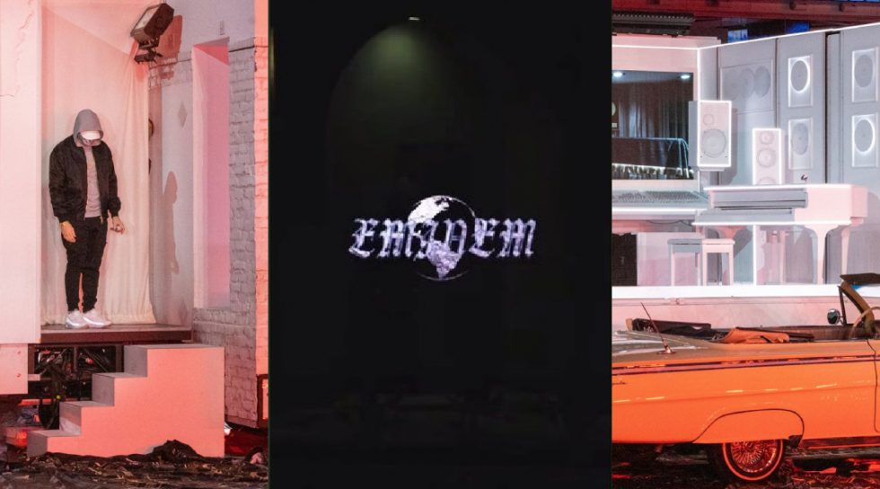
Some pages on the Eminem official website now display a new favicon with a new logo. Since the MTBMB release, a knife branded inverted E served as the main logo in the website design – from a landing page to favicons. Favicons are found next to anything that identifies a website, including bookmarks, tabs, toolbar apps, history results, and search bars. The majority of favicons on eminem.com still show the MTBMB stylised icon, but you can see a new one on tabs displaying images – from Super Bowl photos to pictures from the Mom’s Spaghetti gran opening to the
While the new favicon is unmistakeably different, the size makes it challenging to analyse details. The size of 16×16 pixels doesn’t allow it to get intricate, and this particular icon is not easy to read. Still, it bears a serious resemblance to a logo demonstrated in Em’s recent Instagram promo. The exact proportions and shapes can be seen in both images.

Now, is it important enough? Why pay attention to such a minuscule, quite literally, change in design? Well, small changes usually signal bigger changes to come. Any redesign of the official website is a matter of approval by the label and is never initiated just to refresh the look. A new design means a new project, and that’s just facts. How long might it take, though, is a different conversation. Last time we noticed subtle changes in Em’s official Instagram account before the MTBMB release in September 2019. It took more than three months for the project to become public, but it happened anyway. And we firmly believe that it will happen again. Hopefully, sooner rather than later.

